스타트업 프론트개발자의 칸반보드 풀스택개발기
사내 칸반보드 개발 프로젝트 -2
2024.05.15 - [개발] - 사내 칸반보드 개발 프로젝트 -1포부를 밝혔던 1편에이어 이제 진짜 코드가 들어가는 2편이 시작된다.빠르게 설명부터 들어가자 칸반보드의 핵심의 첫번째는 바로 드래그앤
sancho216.tistory.com
오늘은 칸반보드의 글을 작성하는 글을 넣어본다 !!
그래서 editor를 찾아보았는데 제일 많이 사용하는 에디터인 React-Quill 를 선택했다.
내가 사용해보기도 만족도가 높았던 에디터였다.
react-quill
The Quill rich-text editor as a React component.. Latest version: 2.0.0, last published: 2 years ago. Start using react-quill in your project by running `npm i react-quill`. There are 835 other projects in the npm registry using react-quill.
www.npmjs.com
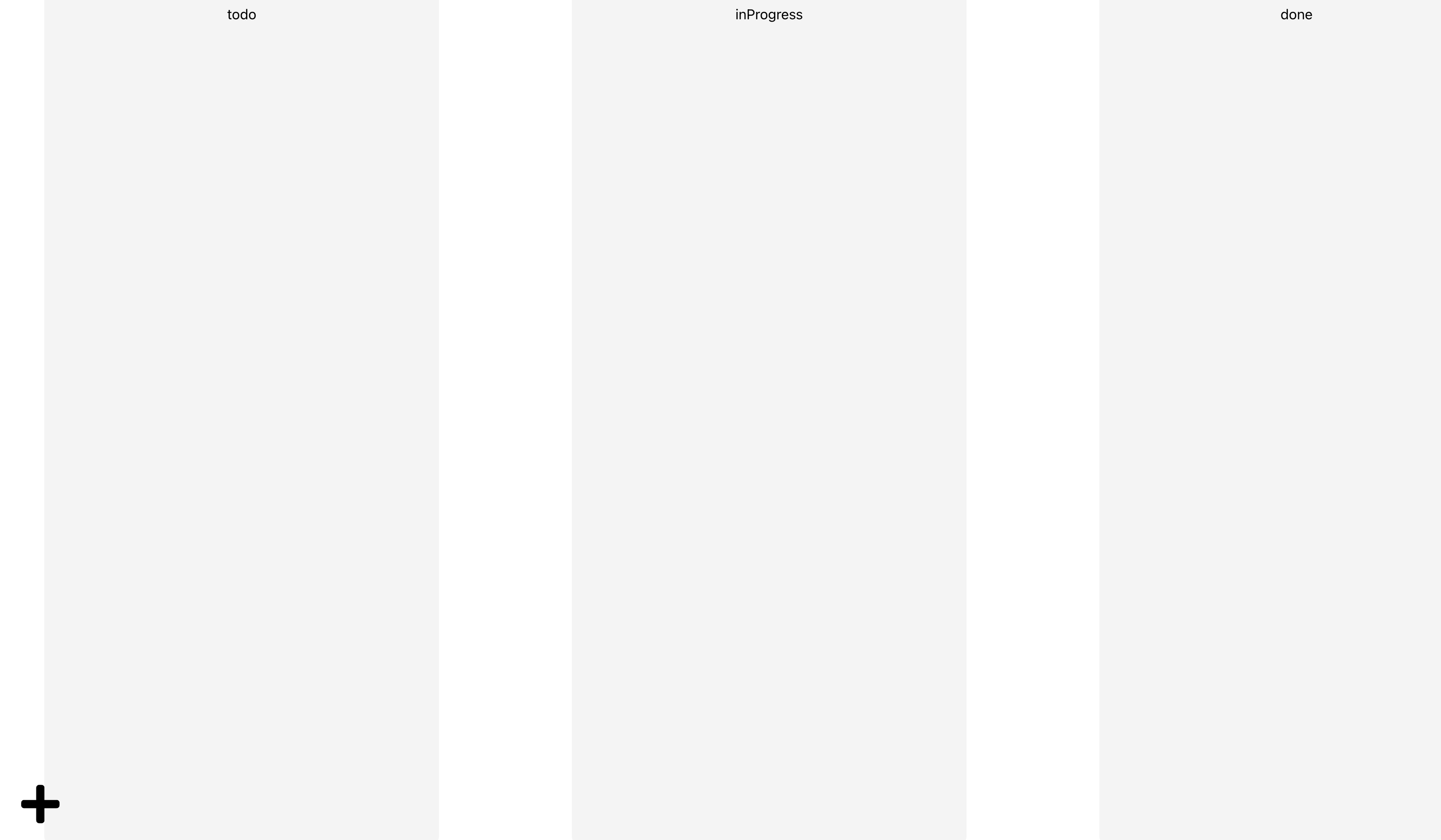
글을 만드는 버튼이 아이콘을 추가했다.
클릭 시 에디터가 나옵니다.
에디터 화면을 잘 보시면 에디터 기능들이 있는데 이것도 커스텀이 가능한 영역이다.
핵심은 moduls와 formats를 활용하면 원하는 기능들을 활용할 수 있다.
사이트 들어가서 보면 확인 할 수 있다.
Quill - Your powerful rich text editor
Built for Developers Granular access to the editor's content, changes and events through a simple API. Works consistently and deterministically with JSON as both input and output.
quilljs.com
하지만 바쁜 개발자를 위해 잘 정리해주신 블로그도 있어 같이 공유한다.
에디터를 적용하니 한 가지 문제점이 있었다.
바로 이미지들 조절이나 위치조절이 불가능 했다.
찾아보니 라이브러리를 활용해 해결 할 수 있었다.
quill-image-resize-module-react 처음에는 이 라이브러리를 사용 했는데 계속 에러가 나서 삽질을 하루동안 후 포기 후 다른 라이브러 리를 찾았다.
그래서 찾은 라이브러리를 공유한다.
- @xeger/quill-image-actions
- @xeger/quill-image-formats
@xeger/quill-image-formats
Allows width, height and float on images in Quill Delta and HTML content.. Latest version: 0.7.2, last published: 7 months ago. Start using @xeger/quill-image-formats in your project by running `npm i @xeger/quill-image-formats`. There is 1 other project i
www.npmjs.com
@xeger/quill-image-actions
Allows user manipulation of width, height and float for images and videos embedded in Quill deltas.. Latest version: 0.7.2, last published: 7 months ago. Start using @xeger/quill-image-actions in your project by running `npm i @xeger/quill-image-actions`.
www.npmjs.com
위에 모든 것을 적용한 내 코드
import React, { useMemo, useRef, useState } from "react";
import ReactQuill, { Quill } from "react-quill";
import { ImageActions } from "@xeger/quill-image-actions";
import { ImageFormats } from "@xeger/quill-image-formats";
import "react-quill/dist/quill.snow.css";

// Register the image actions and formats modules with Quill
Quill.register("modules/imageActions", ImageActions);
Quill.register("modules/imageFormats", ImageFormats);

const formats = [
  "font",
  "header",
  "bold",
  "italic",
  "underline",
  "strike",
  "blockquote",
  "list",
  "bullet",
  "indent",
  "link",
  "image",
  "align",
  "color",
  "background",
  "size", // 폰트 크기 포맷 추가
  "float",
  "height",
  "width",
];

function QuillEditor() {
  const [values, setValues] = useState("");
  const quillRef = useRef(null);

  // 에디터 설정
  const modules = useMemo(
    () => ({
      imageActions: {},
      imageFormats: {},
      toolbar: {
        container: [
          [{ header: [1, 2, , 3, 4, 5, 6, false] }], // Header 설정

          ["bold", "italic", "underline", "strike", "blockquote"], // Bold, Italic, Underline, Strike, Blockquote
          [
            { list: "ordered" },
            { list: "bullet" },
            { indent: "-1" },
            { indent: "+1" },
          ], // Ordered list, Bullet list, Indent
          ["link", "image"], // Link, Image
          [{ align: [] }, { color: [] }, { background: [] }], // Align, Color, Background
          ["clean"], // Remove formatting
        ],
      },
    }),
    [],
  );

  return (
    <div style={{ position: "relative" }}>
      <ReactQuill
        ref={quillRef}
        style={{ height: 650 }}
        theme="snow"
        modules={modules}
        formats={formats}
        value={values}
        onChange={setValues}
      />
    </div>
  );
}

export default QuillEditor;
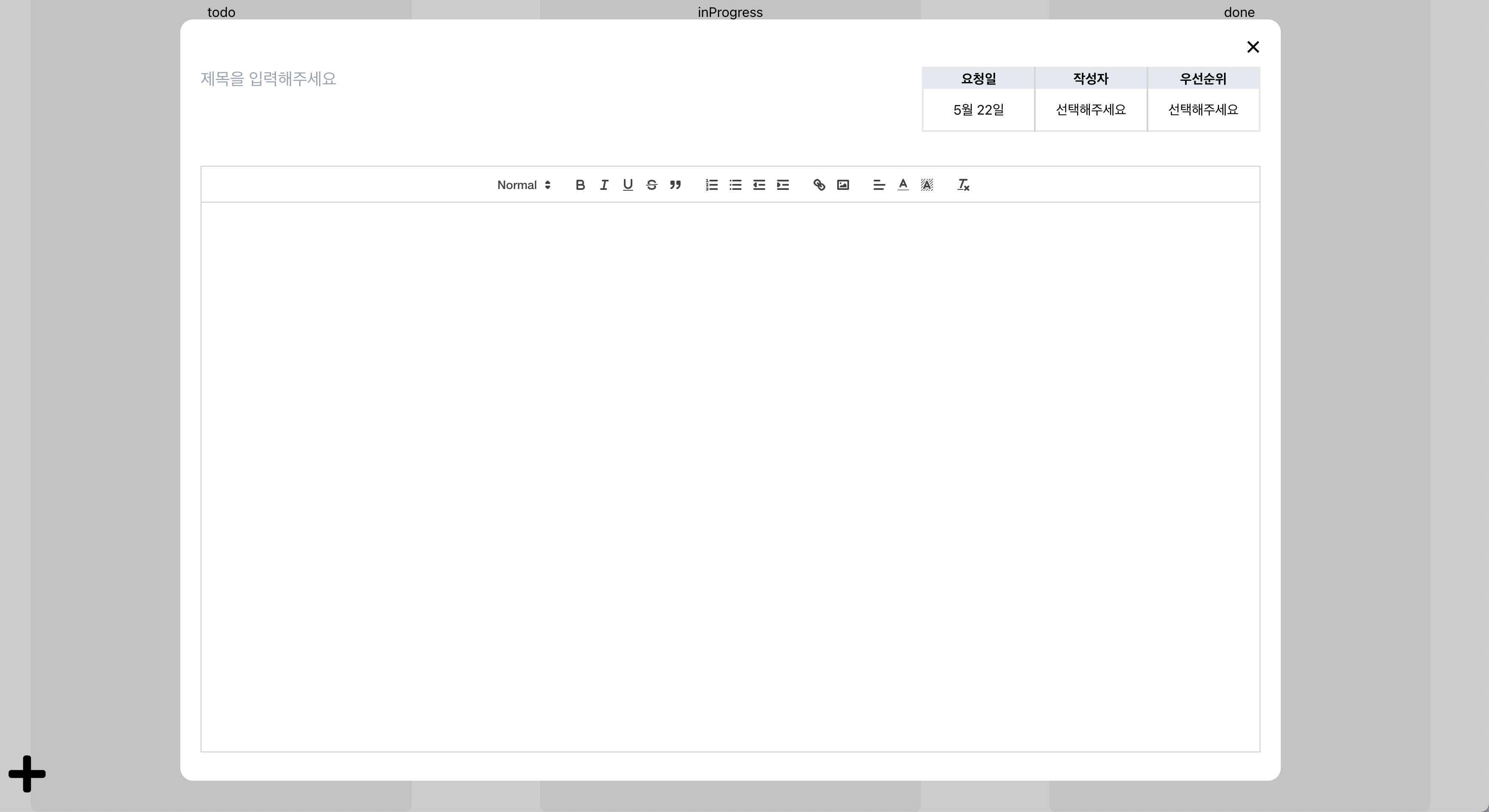
그다음 나는 칸반보드를 작업하는 목적이 사내 QA때 활용하기 위해 작업하기 필요한 요소인 날짜,작성자,우선순위를 추가 작업했다.
작성일의 경우 당일를 추가시켜주면 되었고, 날짜 양식에 맞게 수정해줬다.
  const today = new Date();
  const formattedDate = `${today.getMonth() + 1}월 ${today.getDate()}일`;
코드에서 getMonth + 1를 하는 이유에 대한 설명이다.
JavaScript의 Date 객체에서 getMonth() 메서드는 월을 0부터 시작하는 인덱스로 반환합니다. 즉, 0은 1월(January)을 나타내고, 11은 12월(December)을 나타냅니다. 따라서 사람에게 익숙한 1부터 12까지의 월을 나타내려면 getMonth() 메서드의 반환값에 1을 더해야 합니다.
작성자 와 우선순위 selectbox 작업해 편의성을 높였다.
작성자 selectBox
import React, { useState } from "react";
import { members } from "src/data";
import styled from "styled-components";

const MembersSelectBox = () => {
  const [isOpen, setIsOpen] = useState(false);
  const [value, setValue] = useState("선택해주세요");

  const handleOpen = () => {
    setIsOpen(!isOpen);
  };

  const handleValue = (text) => {
    setValue(text[1]);
    setIsOpen(false);
  };
  return (
    <div className="relative">
      <CustomBtn onClick={handleOpen}>{value}</CustomBtn>
      {isOpen && (
        <ul className="w-100 absolute left-[15px] top-10 z-10 rounded bg-slate-100">
          {Object.entries(members).map((member, idx) => (
            <li key={idx} className="mb-1">
              <button onClick={() => handleValue(member)} type="button">
                {member[1]}
              </button>
            </li>
          ))}
        </ul>
      )}
    </div>
  );
};

export default MembersSelectBox;

const CustomBtn = styled.button`
  width: 100%;
  line-height: 14px;
  background-color: #fff;
  // border: 1px solid #c4c4c4;
  box-sizing: border-box;
  border-radius: 10px;
  cursor: pointer;
  text-align: center;
  /* 말줄임 */
  white-space: nowrap;
  text-overflow: ellipsis;
  overflow: hidden;
`;
우선순위 selectBox
import React, { useState } from "react";
import { priority } from "src/data";
import styled from "styled-components";

const PrioritySelectBox = () => {
  const [isOpen, setIsOpen] = useState(false);
  const [value, setValue] = useState({ text: "선택해주세요", color: "none" });

  const handleOpen = () => {
    setIsOpen(!isOpen);
  };

  const handleValue = (text) => {
    setValue({ text: text[1].text, color: text[1].color });
    setIsOpen(false);
  };
  return (
    <div className="relative">
      <CustomBtn onClick={handleOpen} color={value.color}>
        {value.text}
      </CustomBtn>
      {isOpen && (
        <ul className="w-100 absolute left-[15px] top-10 z-10 rounded bg-slate-100">
          {Object.entries(priority).map((el, idx) => (
            <li key={idx} className="mb-1">
              <button
                onClick={() => handleValue(el)}
                type="button"
                style={{ color: el[1].color }}
              >
                {el[1].text}
              </button>
            </li>
          ))}
        </ul>
      )}
    </div>
  );
};

export default PrioritySelectBox;

const CustomBtn = styled.div`
  display: inline-flex;
  padding: 4px 10px;
  justify-content: center;
  align-items: center;
  gap: 8px;
  border: 1px solid ${(props) => (props.color ? props.color : "none")};
  color: ${(props) => (props.color ? props.color : "black")};
  cursor: pointer;
`;
이렇게 작업하니 얼추 뭔가 갖춰진 것 같아 뿌듯했는데 아쉬운게 뭔가 더 편리했으면 좋겠다는 생각에 고민을 했다.
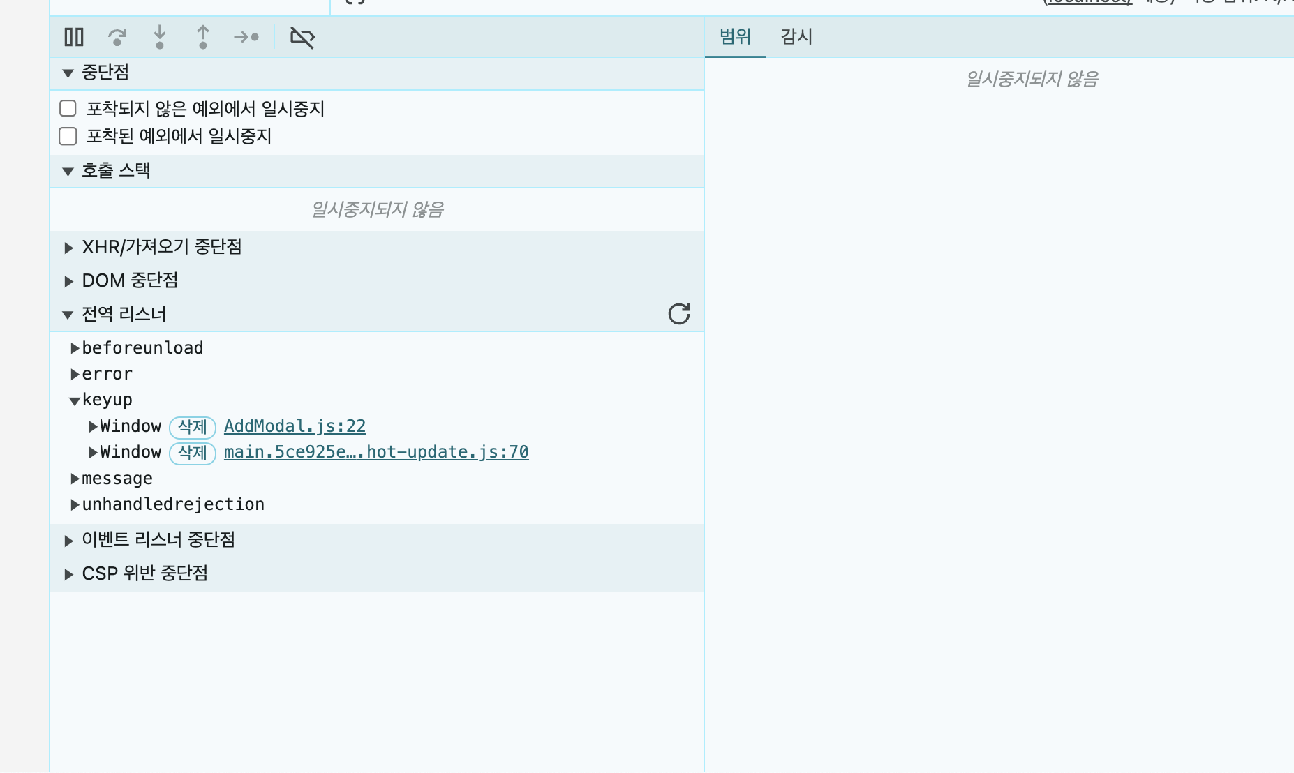
고민 후 넣은 기능이 바로 단축키 기능이었다.
내가 생각한 단축키 2가지 였다.
1. 글 생성
2. 글 저장
생각보다 단축키 기능은 어렵지 않았다.
useEffect 를 활용해서 addEventListener 를 활용해 전역객체에 넣어주고 활용 후 제거를 하면 동작이 가능했다.
  글 생성
  useEffect(() => {
    const handleKeyUp = (event) => {
      if (!isModalOpen && event.ctrlKey && event.key === "Enter") {
        setIsModalOpen(true);
      }
    };

    window.addEventListener("keyup", handleKeyUp);

    return () => {
      window.removeEventListener("keyup", handleKeyUp);
    };
  }, [isModalOpen]);


  글 닫기

    useEffect(() => {
    if (isOpen) {
      const handleKeyUp = (event) => {
        if (event.keyCode === 27) {
          setColumns((prev) => ({
            ...prev,
            todo: [...prev.todo, text],
          }));
          onClose();
        }
      };

      window.addEventListener("keyup", handleKeyUp);

      return () => {
        window.removeEventListener("keyup", handleKeyUp);
      };
    }
  }, [isOpen, text, setColumns, onClose]);
사진에서 추가한 이벤트를 확인 할 수 있다.
다음 기능은 페이지에서 카드를 클릭하면 작성했던 데이터들을 보여줘야 했다.
그래서 카드 컴포넌트에 코드를 추가해줬다.
이름도 그래서 카드에서 카드 모달로 변경했다.
import React, { useState } from "react";
import { IoCloseSharp } from "react-icons/io5";
import styled from "styled-components";
import MembersSelectBox from "./MembersSelectBox";
import PrioritySelectBox from "./PrioritySelectBox";
import QuillEditor from "./quill/QuillEditor";
import { Contents, ModalWrap, Overlay } from "./AddModal";

const CardModal = ({ id, status = "to-do", data, onDragStart }) => {
  const [isOpen, setIsOpen] = useState(false);

  const today = new Date();
  const formattedDate = `${today.getMonth() + 1}월 ${today.getDate()}일`;

  const handleTitle = (e) => {
    const { value } = e.target;
    // Update the state with the new title
  };

  const handleClose = () => {
    setIsOpen(false);
  };

  return (
    <>
      <Wrap
        draggable="true"
        onDragStart={onDragStart}
        id={id}
        data-task-id={id}
        onClick={() => setIsOpen(true)}
      >
        <div>
          <div className="flex gap-1">
            <div>제목: </div>
            <div>{data?.title}</div>
          </div>
          <StatusChip>{status}</StatusChip>
        </div>
      </Wrap>

      {isOpen && (
        <Overlay>
          <ModalWrap>
            <IoCloseSharp
              size={25}
              className="absolute right-5"
              onClick={handleClose}
            />
            <Contents>
              <div className="mb-10 flex w-full items-start justify-between pt-4">
                <input
                  value={data?.title}
                  className="w-[500px] text-xl"
                  type="text"
                  placeholder="제목을 입력해주세요"
                  onChange={handleTitle}
                />
                <table className="text-20 ml-3 w-[400px] table-fixed border-2">
                  <thead>
                    <tr>
                      <th className="border-r-2 border-neutral-300 bg-slate-200">
                        요청일
                      </th>
                      <th className="border-r-2 border-neutral-300 bg-slate-200">
                        작성자
                      </th>
                      <th className="bg-slate-200">우선순위</th>
                    </tr>
                  </thead>
                  <tbody>
                    <tr className="h-[50px]">
                      <td className="border-r-2 border-neutral-300">
                        {formattedDate}
                      </td>
                      <td className="border-r-2 border-neutral-300">
                        <MembersSelectBox />
                      </td>
                      <td>
                        <PrioritySelectBox />
                      </td>
                    </tr>
                  </tbody>
                </table>
              </div>
              <QuillEditor value={data?.contents} />
            </Contents>
          </ModalWrap>
        </Overlay>
      )}
    </>
  );
};

export default CardModal;

const Wrap = styled.div`
  border-radius: 8px;
  background-color: white;
  border: 1px solid #ddd;
  padding: 8px;
  margin-bottom: 8px;
  cursor: pointer;
`;

const StatusChip = styled.div`
  width: 100px;
  background-color: #f0f0f0;
  border-radius: 4px;
  padding: 4px 8px;
  margin-bottom: 4px;
  font-size: 12px;
`;
물론 더 데이터를 추가해줘야 하는데 일단 백엔드 작업으로 넘어가고 싶어 여기까지 프론트 작업을 마무리하고 국비학원 이후로 손을 뗐던 백엔드 작업을 시작할 예정이다. 또 얼마나 많은 역경이 나를 기다리고 있을까 ?? 설렌다.
최종적으로 지금까지 작업한 내용물을 영상으로 공유한다.
도움 받은 블로그
React Quill Editor을 적용해보자
이번 프로젝트에서 위지윅(WYSIWYG) 에디터이다. 여러 에디터가 있지만 그 중에 react-quill이라는 에디터를 이용하게 되었다. 이 에디터를 선택하게 된 이유와 react-quill 기본이랑 커스텀 툴바, 이미
velog.io
230823 React Quill, Image Resize | 메모리 | Zustand
React Quill 사용하기 ❓ Problem 이전 글을 보면 알 수 있듯이, React Quill 에디터를 사용하기 위한 기본 설정은 마친 뒤였다. 근데 직접 사용해보니 에디터 내에서 bold와 italic이 적용이 되지 않았다.
velog.io
'개발' 카테고리의 다른 글
| 사내 칸반보드 개발 프로젝트 - 5 (0) | 2024.05.26 |
|---|---|
| 사내 칸반보드 개발 프로젝트 - 4 (0) | 2024.05.22 |
| 사내 칸반보드 개발 프로젝트 -2 (0) | 2024.05.16 |
| 사내 칸반보드 개발 프로젝트 -1 (1) | 2024.05.15 |
| tailwind css prettierrc 적용하기 (0) | 2024.05.10 |


댓글